This week, we revisited the hot topic of branding, interviewing the designers working with breweries such as Pirate Life and Feral and chatting to Cheeky Monkey about their recent relaunch. Today, continuing that theme, Ross Lewis chats to a WA designer exploring the potential of cans as well as a brewery owner and an American illustrator whose label and can designs are among the most eye-catching in Australia.
Many see it as a just a beer can. More are viewing it as a blank canvas.
Brewers with a keen eye for marketing no longer regard the humble tinny as little more than a means of packaging their beers but as an opportunity to showcase their brands fully and capture a new audience.
As Boston Brewing Company’s Tyson Addy said on the release of his team’s new canned beer range earlier this year: “Bottles don’t give you much room to tell a story. Now, with cans, we have a 360-degree canvas on which to paint the picture of who we are.”
Flavour and aroma remain the priority for any brewery yet the look is also important. After all, the oft-quoted adage in the game is that consumers first drink with their eyes. Today, their peepers are being stimulated like never before.
As we explored in The Big Issue: Branding Revisited, brewers want their beers noticed on shelves and in fridges. In Australia, 80 percent of brews are sold in packaged form so individual brands need a point of difference – they need to stand out from the crowd.
Both Boston and fellow WA brewery Nail turned to design guru Jarrod Fuller from Zendoke when opting to rebrand through cans. Each took a different approach but say they've achieved great results in generating brand recognition.
“The can becomes something of a postcard for breweries,” says Jarrod. “Basically, you’re trying to tell a story about where that beer comes from in an artistic way.
“Take out the barcode and a few standard tags and there is more room for breweries who are going to cans to tell that story.”
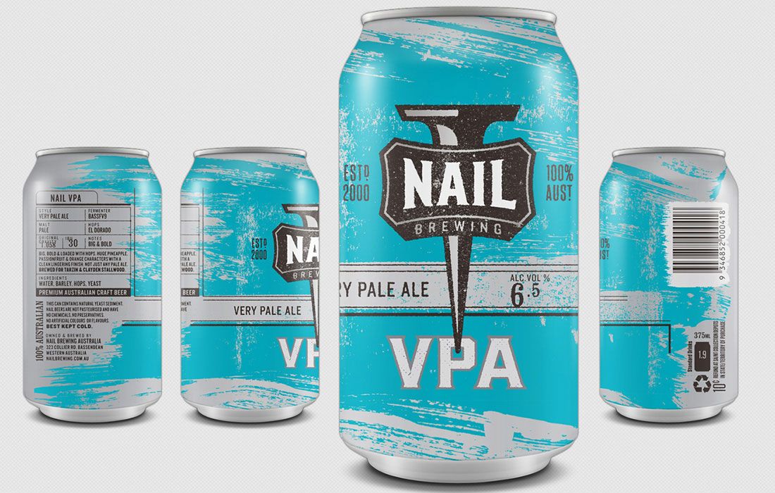
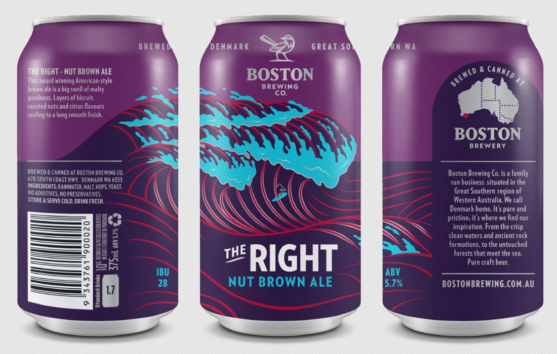
For Boston, Jarrod honed in on the ability to rotate cans to provide something akin to a Cinéma Lumière clip when the entire label was viewed. However, for Nail it was the colour that was crucial. It was about presenting a consistent image with the different brews defined by various shades of the rainbow (in a manner not dissimilar to the just launched cans from Newstead Brewing that also paint a consistent picture across the range).
“I think there has been a circle of change. Some breweries had gone for some crazy labels on bottles and a lot of art – I mean in terms of heavy art,” say Jarrod.
“That isn’t necessarily what is going to catch the attention anymore. But the difficulty in using the (on-can printing) methods for Boston and Nail is that we only have four colours, and the colour of the can (silver), to work with. That can be an advantage, too, because it keeps things simple.”
Jarrod's vivid blue presentation for Nail's VPA has already helped make the beer the brewery's biggest packaged seller within a year of its first appearance in fridges. And the Boondie Rye Pale for Boston has been lauded for its ocular opulence and for taking a circular approach to telling a brand story. What's more, Boston’s Right Nut Brown Ale can (pictured below), designed by Jarrod in honour of a local Denmark surf break, took out the Perth Royal Beer Show trophy for best packaging earlier this year.
“There was a bit more to Boondie because there was the story of the elephant rocks that had to be told,” says Jarrod, referring to the natural stones found near the brewery in the Denmark region.
“The can gave us the opportunity to do that. It delivered where the brewery was and what they were about through the Boondie image. Cans have become important in selling the company image.
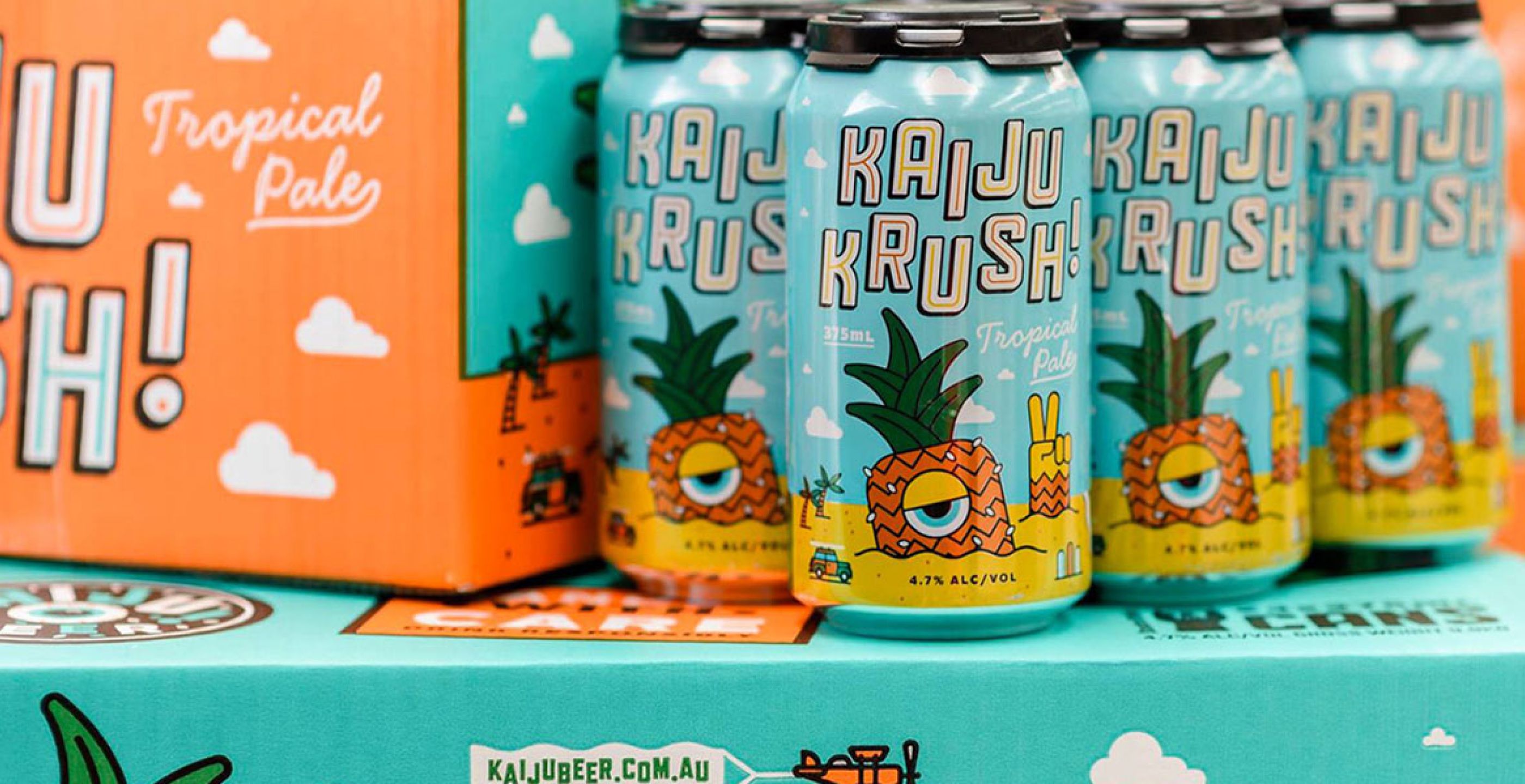
"Take KAIJU! Beer with Krush. You don’t have to see the logo on the can to know it is KAIJU! And then there is Balter with their simplicity. There just wasn’t anything in the market like it. But it is a perfect approach. You know now when you see the can that it is a Balter.”
KAIJU! was already renowned for its out there bottle labels, helped by a predilection for packaging in 500ml glass. The Japanese inspired monsters (and the odd hero) have almost take on a life of their own over the past three years, with linked stories between different labels there to be picked up by the keen eyed and nerdy.
The Victorian brewery's co-owner Callum Reeves re-enlisted US-based illustrator Mikey Burton to design the Krush cans (pictured at top) and then take his concepts from the Cthulhu Black IPA and Double IPA bottles into can form. He was ecstatic at how the KAIJU! ethos translated to the smaller package and sales have followed. Krush is already the business' biggest seller, going past its Golden Axe cider, while they've had to find multiple extra slots in the production schedule for the black IPA too.
Further highlighting their passion for tinnies, they have their own canning line arriving this month too.
“We've always wanted our creatures to be as big as possible, so the full wrap-around is great for that,” says Callum. “Plus, we're using 375ml cans which have extra height over the 330ml or 355ml ones. All these things add up to being able to create a really impactful design.
“Having that full wraparound has given Mikey more opportunity to explore the environments in which the creatures dwell. On each can, Mikey has been able to include elements that add an extra chapter to each creature's story."
Mikey revelled in the chance to paint a picture that told a thousand words about the beer and the brewery.
“Like Callum said, the main difference is that it allows for a bit more storytelling,” he says. “The can acts much more like a comic strip than the bottles do.
“Outside of colour, it comes back to storytelling. The idea of using Japanese super monsters to sell beer is an original idea that no one has really tapped – sorry for the beer pun.
“To me, the idea is always more important than the style or colour, and KAIJU! is quite memorable.”
And, as the preceding article to this highlighted, lodging your brand in a customer's mind and creating a mental shortcut is crucial – however you achieve that goal.
"The story is always ridiculous," says Callum of KAIJU!'s designs, "but I hope people are amused by the little extra touches.”
About the author: Ross Lewis is editor of beer website, The Sip.


